Today, we are all aware that the majority of websites must meet a set of standards regarding code, accessibility and usability. Therefore, that browsers will understand that programming optimally to display it to the user. The use of style sheets for performing the functional aspect of our screens web design becomes a huge factor.

source: Jeffrey Zeldman
The use of tricks, and advanced techniques, code blocks and web programming resources enable the display of groups of layers, applications and other elements on our websites that depend mainly on how to interpret and run by the browser such cascading style sheets (CSS).

source: Jeffrey Zeldman
The recommendations occurring from various professional institutions for the effective operation of our web sites and how they adapt fully to the user’s needs, along with the technological requirements, become a central pillar to web styles.

source: Serge Kij
– Please, do not use Flash: use it for an object or element in the web. Most of devices and users currently not why have the updated version of Adobe and, sometimes it is violent to download apps against our will. Google has never been a friend of Flash and web sites developed in this programming language. The positioning of text and images, is understood as a film loop, without identifying parts of code.

source: Joseph Casabona
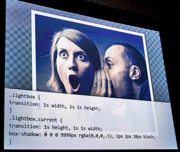
– Designs white contours on the photographs: if you try to give a creative touch when it comes to present images in a web, develop a new concept of programming. Try to choose a simple code that is capable of displaying a frame around the photos without having to edit them in Photoshop or Corel Photo Paint. The white frame that mimics the contours of polaroid images can be similar to this code:

source: AALISHAN MATRIX
.photo {border:4px solid #FFF}
<img sr=”imagenes/mimagen.jpg” class”photo”>
– Use shadows in texts, images or both: In addition, sometimes you can choose to use web styles completely out of 2D graphic design, and even 3D programs. With CSS styles you may be mastered shadows cast on objects or other elements. The way in which increases the contrast of floating objects on the Background page, or even on other elements, it may be done using alternative custom code.

source: Jeffrey Zeldman
img.dropShadow {background: miweb(imagenes/dropShadow.gif) right bottom no-repeat}
Use class=”dropShadow” above the label <img> in each of your photographs, knowing the width and high lightly less who the shadow created, to enjoy this great effect.
– Identify with color annotations regarding the programming code: at the moment to resume a project developed by other professional, not we’d confront a project of which we do not understand absolutely nothing and didn’t even know where to begin it. The code indentation and the distinction of comment lines using colors helps put us between the maremagnum of tags to locate the part that you want to edit.

source: Jeffrey Zeldman
// Way in which the contact form is sent
- echo’<p>’ you have sent the following message to’;
- echo $recipient;
- echo’:<br/><em>
- echo stripslahes($_GET[‘sender_message’]);
- echo ‘</em></p>’;
– Center your web content using divs: that the contents and the container of a web site to start in the upper left corner of your browser could not go to irritate more to a user. After moments of confusion, our visual instinct will head to the right side of the monitor content or Background, in this case empty. The comfort of the user and the adaptation to times today are essential, therefore, is starting from a central axis in the web browser and the elements of the Body expand sideways and down. Position div container in the centre, but never using <div align=”center”>. This will cause all text and images focusing and is not what we want. To focus only the container of your website use the following code:

source: Linux Screenshots
.contenedor {
position: absolute;
top:0px;
magin-left: auto;
margin-right: auto;
}
– Don’t be afraid to get inspired and learn from experts and professionals. Oh, and please, mock-up in columns: the print layout can be the best reference for its attraction on readers, so try to design the content using rows and columns to locate the text and the and images on your web. The cohesion, coherence and well-executed disposition of information must create flows to not produce visual rebounds on the user who is visiting your page. Two or three columns could be a good start for the layout of content. You must only use the information that you want in the selected locations.

source: Serge Kij
<div id=”col1″>Contenido columna 1</div>
<div id=”col2″>Contenido columna 2</div>
<div id=”col3″>Contenido columna 1</div>
#col1 {float: left; width:20%;}
#col2 {float: left; width:60%;}
#col3 {float: left; width:20%;}
From juanjook.com I me effort because all online projects conform to the html standards and of css styles, adapt to the demands of applications and users. Professional presentation and cohesive content using classes, id, divs or stylesheets in an external document is more than an obligation in the daily work with clients. Make your own CSS style sheet and display it in a way that other professionals, as well as browsers, they can understand it.

Comenta comenta y así hablamos